In the 21st century, we all are attracted towards a mobile-first consumer marketplace and businesses are targeting their growth by designing mobile optimized website. With the availability of lightning-speed internet connections, this is the time for the growth of mobile audiences.
Page load time is crucial when it comes to the mobile version of your website. Mobile users are typically on the go all the time, and they would have very little patience for mobile sites that take forever to load. So if you want to keep the attention of mobile users long enough to generate leads or drive conversions, your mobile website loading speed has to level up. If businesses do not design mobile responsive websites they may lose a ton of traffic as Google says 22 seconds is the average load time it takes to completely open a page. Google says site speed is a ranking factor for mobile sites. So if your site isn’t fast, both your audience and Google will think poorly of it. You’ll lose visibility and traffic. The faster your site loads, the lower the bounce rate. If your site is fast, you have a better chance of ranking on Google over slow sites.
What is page speed?
Page load time is the time it takes for a page to load in the browser after a user clicks on a link or makes a request. Technically, this is the speed at which a web page or media content is downloaded from website hosting servers and displayed on the requesting web browser. Page speed is often confused with “site speed”, which is the page speed for a sample of page views on a site. Site speed affects Google ranking and shows how quickly users are able to see and interact with content. Page speed can be described as the time it takes to fully display the content on a specific page or how long it takes for your browser to receive the first byte of information from the webserver.
You can evaluate your page speed with Google’s Page Speed Insights. Higher site speed can result in greater ranking on search engine result pages (SERPs), higher website traffic, and positive user experiences. Businesses should focus on creating mobile-friendly website design so that the users get to avail the services of the company any time they wish to. Poorly performing sites that render slowly in a browser can drive users away. Conversely, sites that load quickly will typically receive more traffic and have better conversion rates. In terms of user experience and creating mobile-friendly website design, there are three core aspects that you need to know:
- Your browser response to page load requests.
- The view within the duration for delivering requested material from the website hosts to the browser.
- The view of the end-users as the requested web page renders on the browser.
Why site speed is important
Almost every business today has an online presence in the form of a website, social media profiles, etc. Having mobile-friendly landing page design, theme, user navigation, and relevant content are all critical elements of a good website. One thing many businesses tend to overlook is the page loading speed. To increase your revenue you need to have a mobile-friendly website design so that the mobile users are not left out from getting in touch with your company’s product or services. A mobile responsive website not only makes the user avail the services from the comfort of their home but also increase trust in your brand. They even become partial promoters of your business and help in peer-to-peer marketing. If you are not getting good speed then you can outsource SEO services to a white label SEO Company and get the experts to meet your business goals.
Although target audiences are the prime reason why mobile website speed is important. Google also uses the speed of your website as a ranking signal. Therefore, if you want your website to rank higher in the Google search results, it’s time to step up your game and make sure your website is mobile friendly and increase page loading speed up to the mark. Conduct a speed check to find out if the load time of your website is too long, and if it is so, then create a website that is faster as your goal is to enhance the user experience because you want those users to keep coming back.
We’ve all heard old age saying” First impression is the last impression.” Well, that particular concept applies to websites as well. Apart from the fact that your audience today is probably the most impatient generation of all time, you have to understand that nobody likes a slow website. Nevertheless, here are a few important reasons why website speed matters:
- Conversion rate – The higher the speed of the website, the greater is the chance of the visitors to get converted. Businesses should consider designing mobile-friendly websites and create urgency to increase conversions. The mobile website should be made user-friendly, and as the content to be displayed is on a smaller screen, so the target should only be displaying relevant content. With Google’s mobile-first indexing there has been a positive change in the conversion rate for mobile websites, as campaigns now focus on presenting content on mobile devices as it is pretty much a part of everyone’s lives. You can also outsource SEO services to optimize conversion rate and increase sales and revenue of the company.
- Bounce rate – Bounce rate is the percentage of viewers who leave the website within 5 seconds after reaching the landing page. Businesses work on having mobile-friendly website design and presenting content in an organized way so that each and every segment of product or service is listed and the user is engaged to move further to finally make a purchase. For e-commerce services, conversion rate optimization is very important and proper A/B testing needs to be done for this as there is a variety of options available and thus, campaigns should focus on lowering the bounce rate.
- SEO best practices – If your site is already well optimized for search engines, there are only a few additional things that you need to think about when optimizing the website for mobile devices and Google’s move to mobile-first indexing. Some of the SEO practices to be considered are:
- Page Speed – Beyond optimizing images, you’ll want to minify code, leverage browser caching, and reduce redirects.
- Optimize titles and meta description – Remember that you’re working with less screen space when a user searches using a mobile device. To rank higher on SERPS, be as concise as possible when creating titles, URLs, and Meta descriptions.
- Optimize for local search – If your business has a local element, remember to optimize your mobile content for local search. This includes standardizing your name, address, and phone number and including your city and state name in your site’s metadata.
Tips to optimize page speed
If you want your site to rank on search engines, page speed optimization should be a high priority for you. Google recently announced that it will be “switching to mobile-first indexing for all websites starting September 2020.” Mobile-first indexing means Google bots will only use the mobile version of your website for ranking and indexing. If any pages are not optimized for mobile users, they will not appear in search results.
When it comes to preparing your website for mobile optimization, there are things to consider for both search engine robots and user experience. Follow these tips and recommendations to boost up page speed for mobile website.
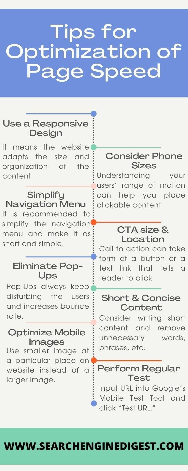
- Use a responsive design – Responsive web design is one of the newer strategies for approaching mobile-friendly website design. It means the website adapts the size and organization of the content on the page to fit the specific device. This type of approach often leads to a better user experience and search engine optimization value.
As more and more types of devices are created with different screen sizes, it is important to have a mobile responsive website that can function properly under any circumstance. Even when users switch the orientation of their device (landscape vs. portrait) or alter their system preferences to use larger text sizes, a responsive design will ensure your website still operates as it should. You can get in touch with a white label SEO Company and perform an SEO audit to get the best design recommendations for your mobile website.
- Consider phone sizes – When designing the desktop version of your site, there is a lot more freedom, but for mobile devices there are limitations. Understanding your users’ range of motion can help you place clickable content in more accessible areas of the screen, such as avoiding the corners and the top of the device.
You should also think about the sizes of phones commonly used. Phone screens have been getting larger, which means you can fit more content on the page, but at the same time you should keep in mind that users’ cannot reach every corner of the screen with a single click. By outsourcing SEO services, the experts align the content as per the phone size and help in designing a mobile responsive website.
- Simplify navigation menu – If you have optimized your website’s navigation menu, you are on the right track towards optimizing a mobile responsive website for user experience. It is recommended to simplify the navigation menu and make it as short and simple to use as possible.
The use of the hamburger menu style has become popular among mobile versions of websites. This menu takes up less space on the screen while ensuring the menu items appear large enough for the user to easily select with their finger.

- CTA size & location – Calls to action (CTAs) and clickable elements on a website are important to help users navigate your website. When it comes to CTAs on mobile devices, it is important to optimize the size of the button and consider how far apart each button is from the other and where they are located on the screen. Understanding your users’ scanning habits can help you determine the best placement for high-priority CTAs on the page.
Remember, users start their scan in the upper left and move their way down. Where you place your CTAs can make a big impact on user experience and action completion rates. The best practice is to make the process for the user as simple and quick as possible. To get proper positioning of CTAs, you need to have a proper SEO plan and strategy that works best for your business.

- Eliminate pop-ups – There is no doubt you would have probably run into a few unclosable pop-ups while searching a website on your mobile device. Pop-ups are incredibly harmful to user experience, and the more difficult they are to close, the more likely a user is to leave the site entirely. Pop-Ups always keep disturbing the users and increases the bounce rate.
The best course of action for pop-ups on mobile devices is to avoid using them whenever possible. This includes promotions, advertisements, and any other pop-up you may have in place.
- Short & concise content – With mobile device screens being small and narrow, it can be difficult for users to read large blocks of text. Whenever possible, minimize the text on the page into shorter and more concise statements. Ideally, each content section should be completely visible on the screen. That way, the user does not have to scroll to read the full text. Icons, graphics, and numbers are also great ways to say more with less on mobile devices. Consider writing short content and remove unnecessary words, phrases, etc.
- Optimize mobile images – Images are one of the most common reasons for longer load time for mobile web pages. Properly optimizing your images even for desktop viewers will positively impact your website’s SEO rankings and user experience. A large image takes up more bandwidth to load as compared to a smaller image. Use a smaller image at a particular place on your website instead of a larger image.
If you use a responsive website design you can incorporate responsive images into the site. Responsive images mean the size of the image will automatically adjust and compress to fit different screen sizes and types. Try to adjust the size of the image so that it is not appearing blur and is user-friendly to keep the interest of the user intact to scroll further.
- Perform regular tests – Search engines value mobile-optimized websites and want to ensure you can properly develop a mobile-friendly website design. This is why Google designed a free resource to help you test your site’s mobile affability and appearance on mobile devices.
Simply input your website URL into Google’s Mobile-Friendly Test Tool and click “Test URL.”
If the mobile-friendly test tool identified some loading issues, it will display them for you to see under “view details”. Use this free resource to check your website’s mobile compatibility and identify any issues to fix.
How to make website mobile-friendly
Mobile-friendly content just means that content appears well not just on desktop computers but also on smaller mobile screens. That means that the text is easily readable, links and navigation are easily clickable, and it’s also easy to access the content. Using some of the given ways you can make the website mobile-friendly.
- Simplify your menus – Obviously, mobile screens are significantly smaller than laptop or desktop screens. Keep this in mind when designing your menu options. The menu of your desktop site can be more extensive and have lots of options. But this complicates things on a smaller screen. You don’t want visitors to have to scroll or zoom in and out to see all the navigation choices. Everything needs to be concise and fit on one screen.
- Keep forms as short as possible – Think about all the different forms you have on your website. If you’re asking the visitor for a lot of information, it’s not an effective approach. Instead, you should change the design to keep your forms short. Again, if someone is filling out a form on their computer, it’s not as big of an issue because it’s easier to type and navigate on a larger screen. But this isn’t the case with smartphones and tablets. Evaluate your forms, and ask yourself whether you need each line.
- Include a search function – This design principle relates back to your menu options. Right now, some of you may have a menu with 20 or 30 different options. It may seem impossible to try to simplify those options to fit on just one page. Well, it can be done, especially if you add a search bar to your mobile site. Encouraging users to search for what they want reduces the need for you to rely on a large and complex menu. Too many options will confuse the visitor and have a negative impact on the conversion rate. Implement a search bar to simplify your design and make it easy for mobile users to find exactly what they’re looking for.

- Avoid large block of texts – Reduce the amount of text on the screen of your mobile website. You’ll need to use some words to communicate with your visitors, but keep sentences and paragraphs as short as possible. Large blocks of text are overwhelming and difficult to read. Remember, if a paragraph is two lines long on your desktop site, it might be six lines long on a smartphone.
Picking the right font is a crucial design principle as well. You don’t want the text of one line to run into the text of another. Fonts need to be clear and easy to read. But you can also use fonts to set two lines of text apart.

- Device size – Navigating a website from a desktop or laptop computer is simple. It’s easy to control a cursor from a mouse or keypad. But browsing with your thumb on a 4-inch screen isn’t as easy. Keep this in mind when laying out different elements of your mobile site. Buttons need to be large enough to be tapped with a finger. Make sure you keep enough space between buttons so someone doesn’t accidentally click the wrong one.
Having to tap the same button several times to make it work will frustrate mobile users visiting your website. Avoid the corners as it is hard for a person to reach those places with their thumb while holding a mobile device. The reach decreases further as the screen size becomes larger. It’s in your best interest to place the most important elements and clickable buttons toward the middle of the screen.

Round off
Now you must have gotten an idea about the importance of page speed and why businesses need to work on strategies to increase it. For e-commerce SEO services, relevance of page speed increases more as, if they lose their visitor to another website they might not see them turn again. Simplify your menu choices, and keep forms short. Make sure your CTAs are clearly displayed and stick to one CTA per page. Add a search bar to help improve navigation while clearing up space on the screen. You should make it easy for mobile users to contact your customer service team.
References


Leave A Comment