The use of smartphones in the general population is growing at a rapid speed every year. Mobile phone users are growing rapidly at a rate of 2% per year and smartphone use is increasing at an annual rate of 8%. This means as you’re reading this, someone somewhere is buying a smartphone. With such a vast number of users, mobile is one of the most effective means to reach out to your potential customers. With that in mind, you need to implement mobile SEO on your website to guarantee the optimal mobile user experience for your visitors.
What is SEO?
Search Engine Optimization (SEO) refers to the optimization of website in order to get high, but relevant traffic to your website.
- On-Page SEO refers to the practice of optimizing webpages by working on content and HTML source code of a page to increase your search engine rankings and get relevant traffic.
- Off-Page SEO refers to all the efforts taken outside of a website to improve its position on the search engine.
- Technical SEO relates to all SEO practices to improve the technical aspects of a website to align with search engine guidelines to improve the organic rank.
What is mobile SEO?
Mobile SEO or Mobile Search Engine Optimization refers to the practice of optimizing your website for smartphone and tablet users to secure higher rankings on search engines and provide the best experience for your audience.
Not having a mobile-friendly website can create a negative perception of your website, extending to your business, and can lead to users bouncing off your pages, thus hurting your rankings.

Why mobile SEO is important?
If you haven’t been paying attention to mobile SEO, you’re missing out on a major chunk of potential customers. A Mobile optimized website ensures that the visitors find your website easily when making a search query. Mobile friendly SEO also makes for optimal user experience on the visitor’s mobile devices. Users are more likely to return to a website when they’ve had a positive experience.
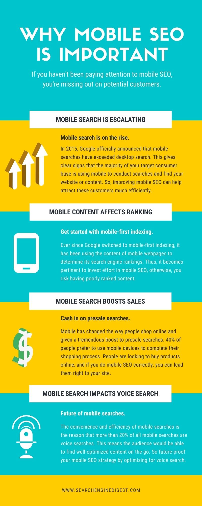
- Mobile search is escalating: Mobile search is on the rise. In 2015, Google officially announced that mobile searches have exceeded desktop search. This gives clear signs that the majority of your target consumer base is using mobile to conduct searches and find your website or content. So, improving mobile SEO can help attract these customers much efficiently.
- Mobile content affects rankings: Ever since Google switched to mobile-first indexing, it has been using the content of mobile webpages to determine its search engine rankings. Thus, it becomes pertinent to invest effort in mobile SEO, otherwise, you risk having poorly ranked content.
- Mobile search boosts sales: Mobile has changed the way people shop online and given a tremendous boost to presale searches. A Google research found that searches for product reviews from mobiles have increased by 35% in a period of just two years. Added to that, 40% of people prefer to use mobile devices to complete their shopping process. People are looking to buy products online, and if you do mobile SEO correctly, you can lead them right to your site and enhance their user experience.
- Mobile SEO impact voice search: Optimizing mobile website will future-proof your SEO strategy since voice search is considered to be the future of mobile searches. The convenience and efficiency of mobile searches is the reason that more than 20% of all mobile searches are voice searches. Voice search has even shifted from mobile devices to home assistant devices like Google Assistant and Amazon’s Alexa. This means that the audience would be able to find well-optimized content on the go.
What are the best mobile SEO practices?
Let’s take a look at the best mobile SEO practices to improve your mobile SEO strategy.
Integrate responsive web design: A responsive web design is vital in making your website mobile-friendly, even Google advocates so. But what is a responsive web design? A responsive web design ensures that your website adapts to any screen the user uses, i.e., it just changes the page layout to adapt to the device. It maintains the same content (like URLs, HTML, images, etc.) from desktop to mobile.
Integrating responsive design in your mobile SEO makes for mobile-friendly browsing experience, thus pulling more leads and convincing the visitors to stay. The key to ultimate responsive design is to code in such a manner that your website’s content adjusts its layout like height, width, resolution, etc. to adjust on each device type. So, no matter whether your audience uses a tablet or mobile, they will get the optimal user experience.

Don’t block CSS, JavaScript and image files: Back in the day, not all mobile devices could support CSS, JavaScript and image files, so web developers would usually block one or all three of these elements for mobile websites (in the robots.txt). Ever since the innovation of smartphone technology, that doesn’t stand true.
Blocking these elements can cause difficulty for Google to access your website which might result in lower rankings. Simply put, Google wants to inspect your website as a human visitor to understand whether or not these elements are enhancing the user experience and also, if you have a responsive website. If you want to verify whether these resources are working for your mobile website, you can check it with the URL Inspection Tool in Google Search Console.
Improve your site speed: One of the most integral aspects of providing a great mobile experience to your visitors is improving the website load speed. People want access to information as soon as possible. If your site doesn’t load fast enough, the visitors will bounce off never to return again. This can severely affect your website’s performance. In July 2018, Google announced that page speed will be a ranking factor for all mobile searches.
If you want to keep the leads on your mobile website, then you must work to improve your website’s load time. Google’s PageSpeed Insights is a great tool to assess the performance of your website and the areas that need improvement. It will also provide you inputs to improve your site’s load time for mobile users.
Following tips will help in improving your website’s load time-
- Optimize the images on your website to scale them to the correct size and adapt to smaller screens
- Minify CSS and JavaScript resources to help your website load faster on mobile devices
- Use browser caching to download new content whenever a visitor visits again
- Reduce unnecessary redirects as they only slow down your site’s speed. Always try to make direct links
Focus on user experience: If you want to implement a mobile-friendly SEO strategy, then your focus should be on providing an optimal user experience to your visitors. Of course, integrating a responsive web design is a step in the right direction, but there are other elements as well that you integrate into your mobile SEO strategy to create a great experience for users.
Following tips will help you in crafting a positive user experience-
- Integrate thumb-friendly designs on your mobile website to make it easier for the visitors o scroll through and click on elements on your page.
- Use image alt tags to inform users what the images on your website are about. Even Google uses alt tags to understand the subject matter of your image.
- Easy to find Call-to-action (CTA) buttons can increase your conversions dramatically. Make sure your CTA buttons stand out to create positive user experience.
- Use clear fonts and large text size to be easily legible on a mobile device.

Be mindful of interstitials and pop-ups: While pop-ups are a great way to attract user attention to a certain action, make sure they do not hinder user experience. Pop-ups can be annoying for mobile users as sometimes they either take up the full screen, leaving the users frustrated and other times, they appear in another window making it harder for the user to switch. If the visitors won’t be able to access the information they came looking for, it can drive them away forever.
Be mindful of the way you use pop-ups on your mobile website. The interstitials and pop-ups should not block the main view of target content on your website. Besides, Google will penalize websites that feature intrusive pop-ups to help users easily access content on mobile and enhance the user experience. So, ensure that you abide by Google guidelines on the extensive use of interstitial and pop-up adverts.
Read up on Google AMP: Google’s AMP or Accelerated Mobile Pages get the web pages to load instantly on mobile devices. You can work up your content in a special HTML code to optimize the pages in such a way that the pages are cached by Google and presented cleanly to make sure it gets delivered at light speed.
AMP is the future of mobile websites, and you should incorporate it into your website to reap its benefits. You can read up on Google’s guidelines that are specific to AMP on Google Search.
Optimize title tags and meta description: Optimizing title tags and meta description is an essential mobile SEO technique. Because mobile users are looking for information on the go, they use these elements to determine whether your listing on the search results is worth clicking.
Title tags act as a preview of your page. They should be concise and informative at the same time. They should also be optimized to drive more relevant traffic to your mobile website. Make sure to use your target keywords so the users know that your result is relevant to their query.
The meta description should provide the users with additional information about what they can find on your page. Use your target keywords in the meta description content to get relevant traffic.
Wrap up
Mobile is the future, and you can be a part of it with a mobile-optimized website. If you want to grow your business by attracting mobile users, then mobile SEO is the only way forward. Mobile optimization is not just about creating content for mobile but also implementing a robust technical strategy.
If you are not sure where to begin, you can always outsource mobile SEO services and let the experts take charge of creating a mobile-optimized website for you.
References:


Leave A Comment